
How to use your brand guidelines effectively
Get your branding ducks in a row with my secrets to create consistent brand visuals. All without having a complete meltdown in Canva.
*Puts hand up to pledge* I’m a designer and I don’t hate Canva. For small business owners it is perfect. (Although if you can’t stand Canva check out Adobe Express - similar idea). BUT... Canva can be super overwhelming when you're new to it.
Tip One: Canva Templates are your branding friend
Let’s start with how to overcome design overwhelm in Canva.
Think of 5 types of content that you post regularly. A great example is a fashion brand I worked with. Their regular content looked like:
Testimonials
Press coverage
their clothing spotted on celebs
New product launches
Comments from an influencer or customer wearing their designs. (Don’t forget professional images with no graphics at all are also a perfect way to post something so this gives you 6 ideas!)
Next, in Canva create ‘empty’ versions of these graphics.
Then all you have to do when you want to post one of your core pieces of content is change the image and the text and you’re done. Such an easy, time saving hack!

Templates for a clothing brand. “Lorem ipsum” is just fake text that designers use to show you where the real text should go.

How the templates look once populated fully with text and images.
Alternatively hit the Template SOS button and let's chat about how I can set these up for you so you don’t have to worry about it at all!
Tip Two: Fancy clothes shops have a point - It’s the same with design.
Now let's chat about how to actually design stuff.
You know those really pretentious clothes shops. (We’re talking Chanel on the Champs Elysees here). What do they all do that makes you subliminally know that what they sell is expensive?
The answer is: They have tonnes of empty space. You have to hike a mile to get from the coats to the handbags.
In design we call this ‘negative space’ and that basically means parts of the page with nothing on. So if you’re going to take away one thing from this blog post, it’s when you design something for your brand leave some space. It makes it look more expensive, less crowded and more like you know what you’re doing. PS: Just leaving a photo plain counts as negative space too.
Remember what Chanel said. Before you leave the house, take one item off…
Here’s an example of leaving good amounts of space ‘empty’ to make the brand seem more expensive:
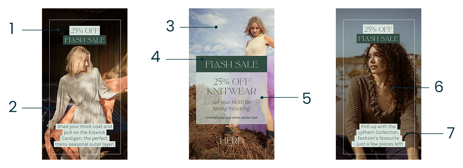
Text not going all the way to the edge, is smaller and central to stand out more
Border evenly spaced from the edge and doesn’t overlap text boxes
Top of image where the model’s face is has no graphic to allow the photograph to speak for itself
“Flash Sale” not touching the sides of the box and centred evenly
Text within box doesn’t touch the edges
Image front and centre with graphics as accompaniments. There aren’t many assets on this template.
Text doesn’t go to the edge. Bigger doesn’t necessarily mean better.
Tip three: Consistency can be more like non-identical twins. Don’t sweat making everything ‘matchy matchy’.
Branding is like a family. The social post is the little brother to the flyer, who has some matching features to his mother, your website, that has the same nose as her daughter, your business card.
But they all have the same family crest (your logo!). Slightly abstract analogy but you can have some fun and mix up all the assets you have in your toolbox.
Not everything needs to have the same dominant colour or match exactly.
But if what you’re really after is the crème de la crème of consistency and your brand guidelines give you temporary paralysis then get a professional in. They can help you set up templates, talk you through your specific brand guidelines and ‘train’ you to feel more confident about what to do and how to do it.
If this is something you would like to chat about with me then let’s book in a brand clinic call and talk about how I can help you harness the power of your branding!
Now implement those tips!
This gives you a couple of great places to start in your bid to make your branding consistent and, more importantly, recognisable to your dream clients.
Set up those templates
Don’t use up every inch of space in a design - let it breathe!
Don’t make everything look identical - play with your colour palette
Get stuck? Drop me an email hello@beckywoodcreative.co.uk